5 GPT Image 2 API Test Prompts I Would Run Before Switching Models
Five practical GPT Image 2 API benchmark prompts for text rendering, layout, brand consistency, product images, and diagrams, plus one real API smoke-test result.
5 GPT Image 2 API Test Prompts I Would Run Before Switching Models
Last updated: 2026-05-14
GPT Image 2 is now documented as an OpenAI image model, so the useful question has changed. The question is no longer only "is it live?" The better question is: does it pass the specific prompts that matter to your product?
This page gives you five practical GPT Image 2 API test prompts. They are designed for migration decisions, not social screenshots.
Real API smoke test
I ran one real GPT Image 2 API smoke test through the current site provider on 2026-05-14.
| Field | Result |
|---|---|
| Model requested | gpt-image-2 |
| Provider label returned | GPT Image 2 |
| Latency | 55.0 seconds |
| Aspect ratio | 1:1 |
| Output saved | /showcase/gpt-image-2-api-test-2026-05-14.png |
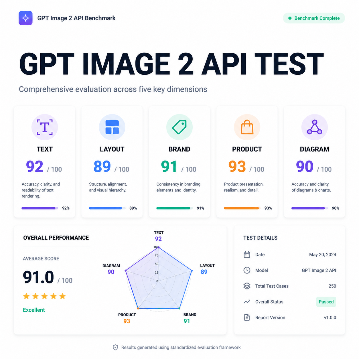
The visual quality was strong, but the output also invented evaluation scores and a date inside the image. That is the main lesson: do not ask an image model to self-grade your benchmark. Use GPT Image 2 to generate the asset, then score the output outside the image with your own checklist.
Test 1: Text rendering in a product hero
Use this when your product needs readable marketing graphics, app screenshots, or launch assets.
Create a clean SaaS dashboard hero image for a GPT Image 2 API benchmark report.
Include the exact readable heading: "GPT IMAGE 2 API TEST".
Show five small evaluation cards labeled TEXT, LAYOUT, BRAND, PRODUCT, DIAGRAM.
Minimal professional style, white background, crisp typography.
Do not invent numeric scores, dates, or test results.
Score it on:
- whether the exact heading is readable
- whether all five labels are spelled correctly
- whether it avoided fake scores and fake dates
- whether the layout would work as a real landing-page asset
Test 2: Brand-safe ad creative
Use this when your app generates ads, social images, or creative variants.
Design a square social ad for a fictional project management app called "FlowLedger".
Use the headline "Close the week without status meetings".
Use a calm B2B palette, no fake logos, no real company names.
Show a clean kanban board and a small calendar widget.
Leave a safe margin around all text.
Score it on:
- exact headline accuracy
- whether the layout leaves safe margins
- whether it avoids real brand names
- whether the output looks like a usable ad, not a generic AI poster
Test 3: Product photography with constraints
Use this when you need ecommerce or catalog-style output.
Generate a realistic studio product photo of a matte black insulated water bottle.
It should stand on a light gray surface with soft shadows.
Add a small removable paper tag that says "BPA FREE".
No people, no extra bottles, no unreadable background text.
Score it on:
- product realism
- whether only one bottle appears
- tag text readability
- whether the object edges are clean enough for ecommerce use
Test 4: Educational diagram with labels
Use this for explainers, docs, onboarding, and blog diagrams.
Create a simple educational diagram titled "API Image Generation Flow".
Show four boxes connected left to right:
1. Prompt
2. Safety Review
3. Image Model
4. Stored Output
Use readable labels, thin arrows, and a white background.
Do not add extra steps.
Score it on:
- exact step order
- label readability
- whether arrows connect correctly
- whether the model avoids adding extra boxes
Test 5: Multi-variant consistency
Use this when your workflow needs multiple images that feel like one campaign.
Create a 2x2 grid of four app onboarding illustrations for the same fictional SaaS product.
Keep the same character style, same color palette, and same UI component style in all panels.
Panel labels: Import, Review, Approve, Export.
Do not change the product name or visual identity between panels.
Score it on:
- whether all four labels are readable
- character and UI consistency across panels
- whether each panel shows a distinct action
- whether the grid feels like one product system
A practical scoring sheet
Use a 0-2 score for each row. That keeps scoring fast and less subjective.
| Criterion | 0 | 1 | 2 |
|---|---|---|---|
| Text accuracy | unreadable or wrong | partly usable | exact and readable |
| Instruction following | misses core constraints | follows most constraints | follows all critical constraints |
| Layout usefulness | decorative only | usable with cleanup | production-ready |
| Brand control | inconsistent | mostly coherent | coherent across the whole output |
| Hallucination control | invents facts | minor extra details | no unsupported facts |
What I would change after the first smoke test
The first smoke test produced a polished benchmark-style image, but it also invented scores and a date. For production prompts, I would now add these constraints by default:
- "Do not invent scores, dates, metrics, badges, ratings, or status labels."
- "Only include text explicitly provided in the prompt."
- "Leave any measurement values blank unless provided."
- "If a label is uncertain, omit it rather than inventing it."
That one change matters for dashboards, compliance visuals, pricing pages, benchmark reports, and any image that could be interpreted as evidence.
Sources
- OpenAI Developers: GPT Image 2 model page
- OpenAI Help Center: GPT Image API
- OpenAI image generation guide
FAQ
Is one API test enough to judge GPT Image 2?
No. One smoke test only verifies that the provider path works and reveals obvious prompt issues. Use at least 20-30 prompts before switching a production workflow.
Should GPT Image 2 outputs be scored by the model itself?
No. The image model can visually invent scores, dates, and status labels. Score outputs outside the generated image with a separate checklist.
What is the most important prompt category to test first?
If your workflow has any text inside the image, test text rendering first. A beautiful image with wrong text is usually unusable.